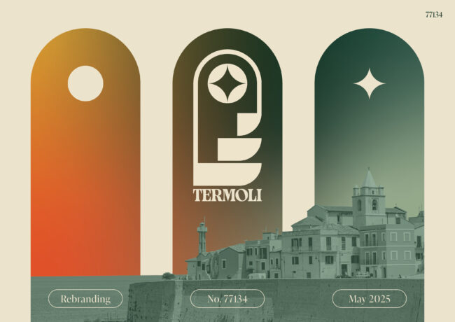
Termoli Rebrand
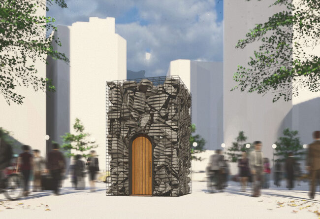
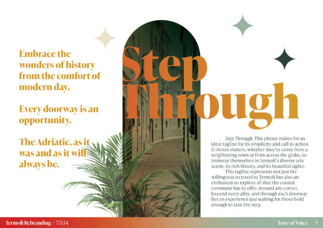
Step Through.
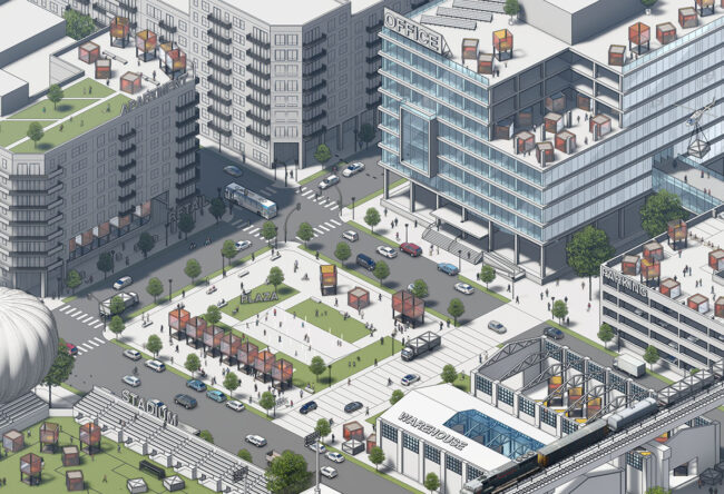
Termoli, Italy
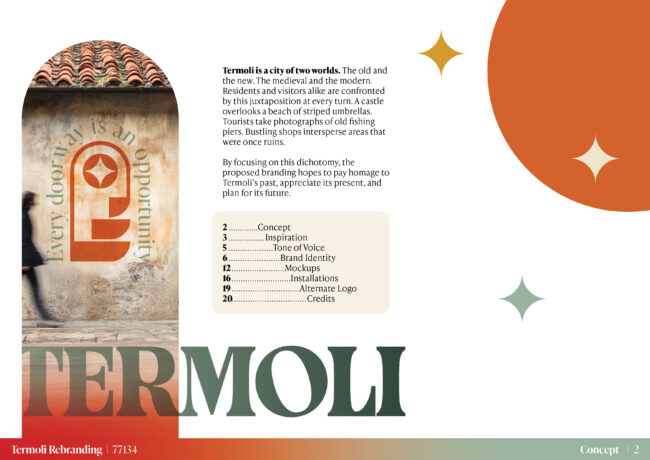
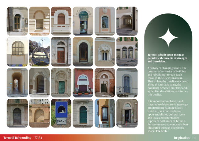
Termoli is a city of two worlds. The old and the new. The medieval and the modern. Residents and visitors alike are confronted by this juxtaposition at every turn. A castle overlooks a beach of striped umbrellas. Tourists take photographs of old fishing piers. Bustling shops intersperse areas that were once ruins.
By focusing on this dichotomy, the proposed branding hopes to pay homage to Termoli’s past, appreciate its present, and plan for its future.
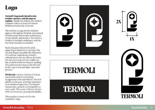
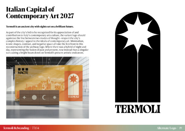
Termoli’s logomark should evoke wonder, mystery, and the urge to explore.
Simple yet refined, the emblem compels visitors to leave the known behind and enter the unknown. The archway as a geometric element appears throughout Termoli, represented in both sacred and secular architecture, ornate motifs, and mosaics. The arch is a symbol of strength, endurance, and the way from one place to another. Stairs disappear beyond the arch, appealing to humanity’s curiosity. The stacked shapes resemble the silhouette of a sailboat, embodying Termoli’s cultural ties to the sea. Above the stairs sits not a looming sun nor a night star, but a hybrid of the two shapes, marking this particular doorway as one that sits at the cusp of day and night—past and present.


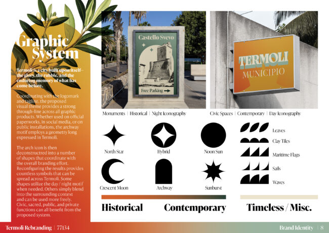
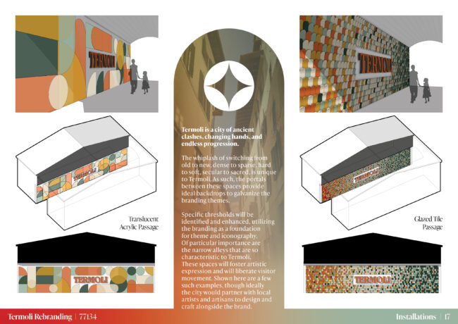
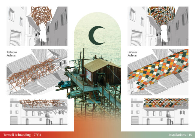
Termoli is a city built upon itself— the glory, the rubble, and the enduring memory of what has come before.
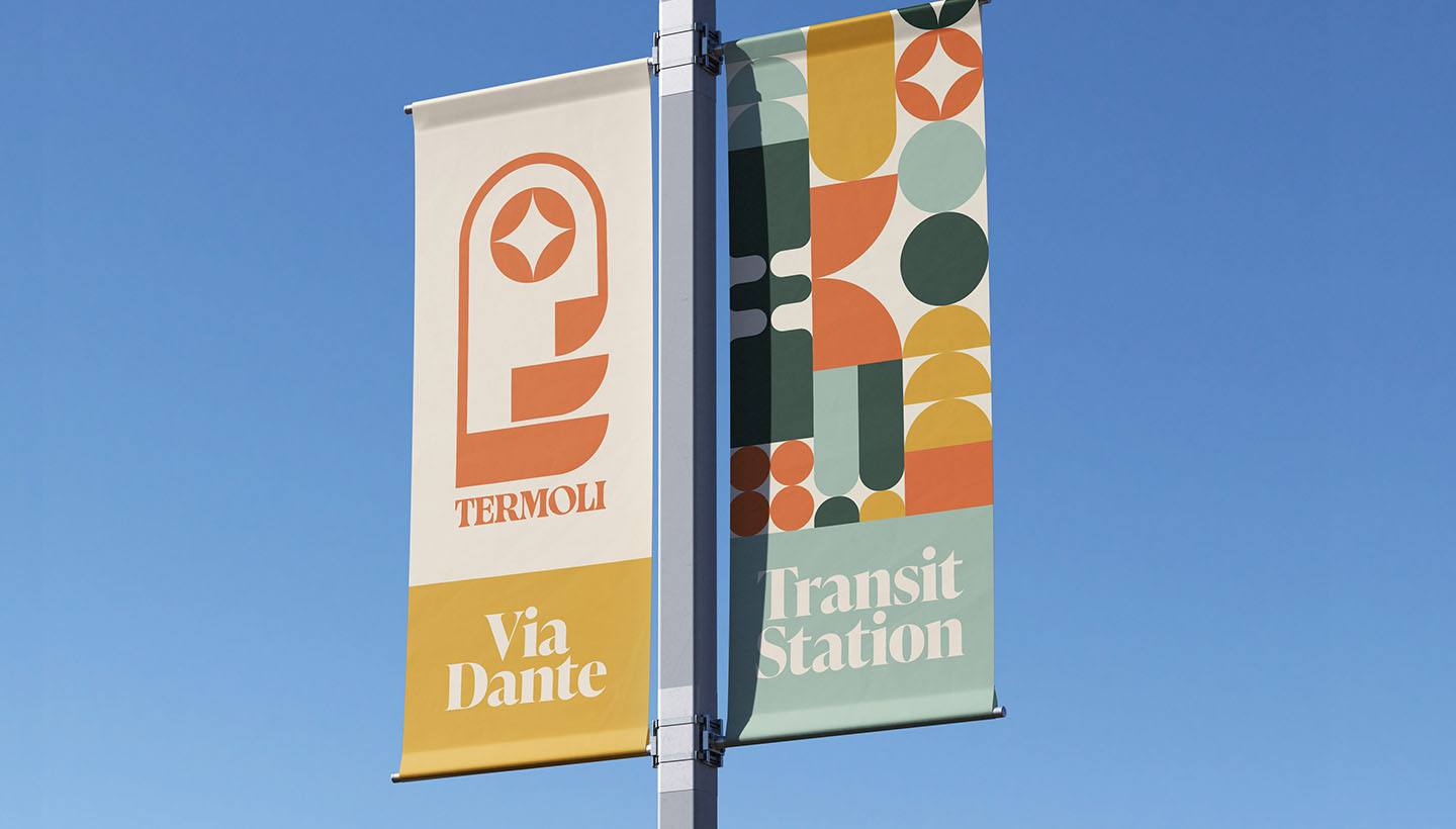
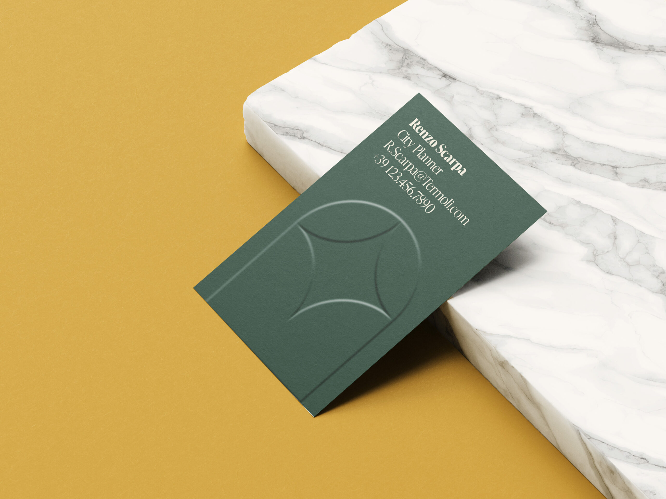
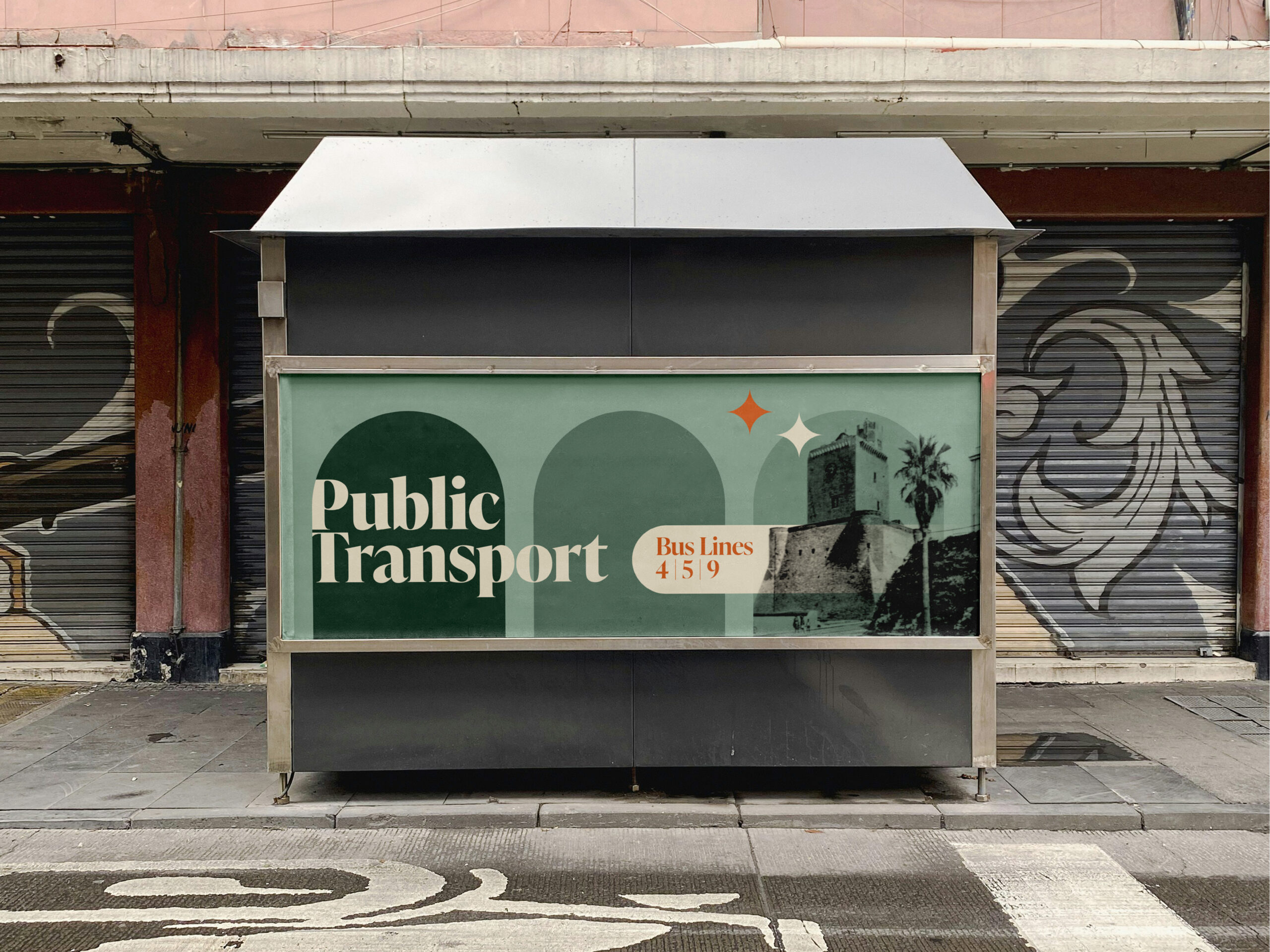
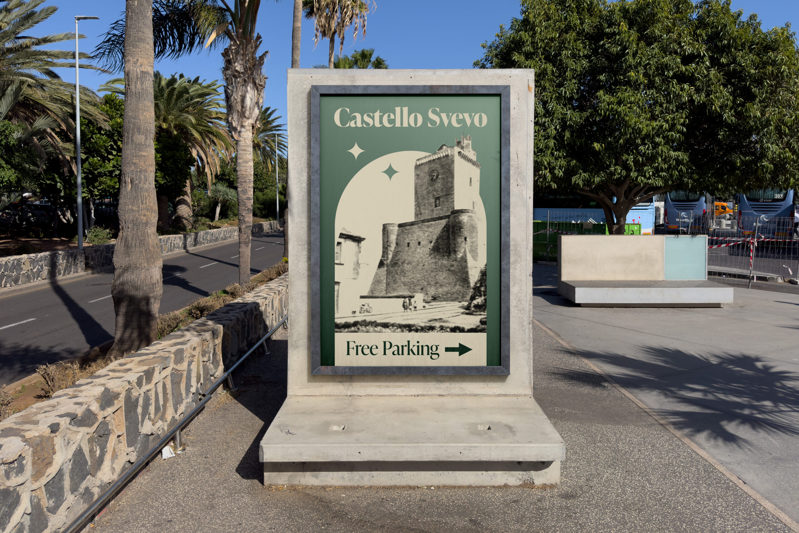
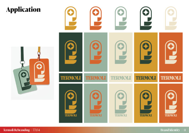
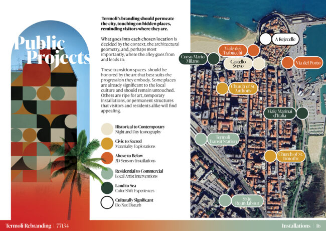
Coordinating with the logomark and tagline, the proposed visual theme provides a strong through-line across all graphic products. Whether used on official paper works, in social media, or on public installations, the archway motif employs a geometry long expressed in Termoli. The arch icon is then deconstructed into a number of shapes that coordinate with the overall branding effort. Reconfiguring the results provides countless symbols that can be spread across Termoli. Some shapes utilize the day / night motif when needed. Others simply blend into the surrounding context and can be used more freely. Civic, sacred, public, and private functions can all benefit from the proposed system.

Explore our submittal package
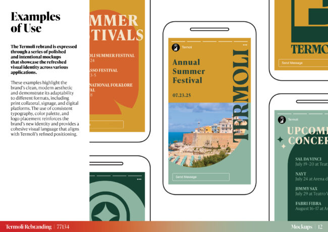
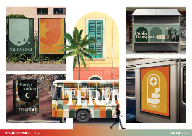
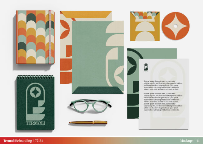
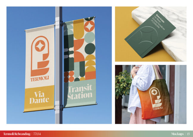
The Termoli rebrand is expressed through a series of polished and intentional mockups that showcase the refreshed visual identity across various applications. These examples highlight the brand’s clean, modern aesthetic and demonstrate its adaptability to different formats, including print collateral, signage, and digital platforms. The use of consistent typography, color palette, and logo placement reinforces the brand’s new identity and provides a cohesive visual language that aligns with Termoli’s refined positioning.