Intimate Prominence: Translating Large-Scale Vision to Small-Scale Experience
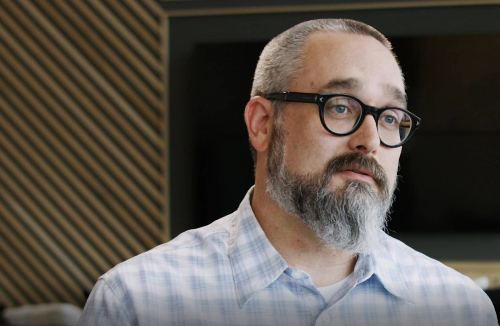
Dan Rider, senior designer and integral member of the Peace Raleigh Apartment’s design team, gives insight into how the development’s scale, human experience, and modern industrial aesthetic contributed to the overall design of the mixed-use project.
With a mixed-use development as significant as Peace Raleigh Apartments, what were some of the challenges you faced when designing at such a large scale?
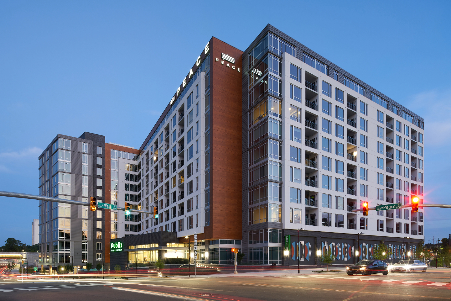
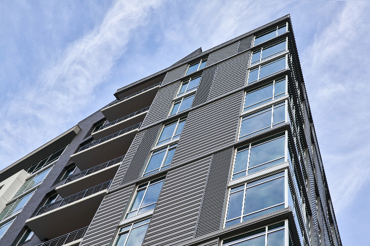
The challenges on a large project like this are two-fold. How do I fit all the program requirements on the site logically and responsively? How do I break the building’s scale down visually so it does not become oppressive or dominate the new growing neighborhood. You really start looking at every single element on the façade as an opportunity to help minimize the scale or add interest to a very large building elevation. So, its not just about material changes. It is about adding a notch or step back at the corner. It is about adding a lot of glass along the top floor to add a level of detail where the building meets the sky. Even the balcony sizes, shapes, and rails become opportunities to provide the building with playful, fun elements.
Standing out while fitting in
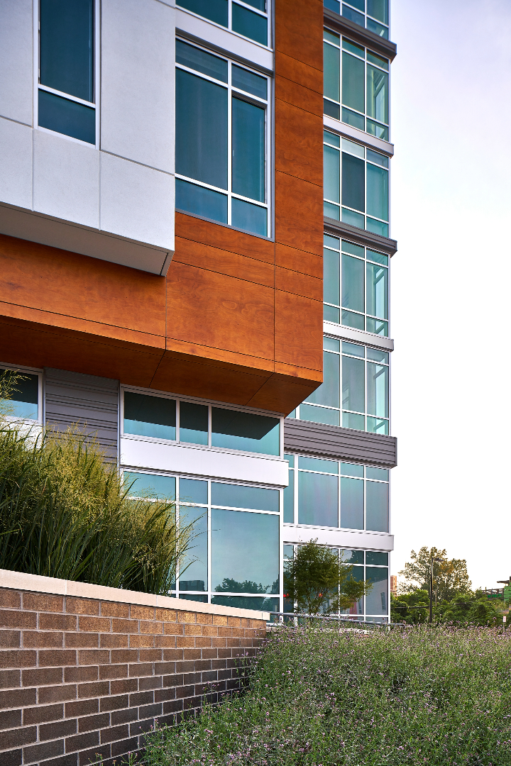
I think the things that we took from the existing context were textures – like brick, corrugated metal, graffiti or the various angle of the hodgepodge of buildings and blocks. While designing, you remember these feelings – both emotionally and from a tactile perspective – and try to implement them into your design solution in logical ways. The visually obvious texture is the corrugated metal. We applied it to the corner tower at Peace and Harrington to give it the most visibility to the inbound downtown traffic, as well as driving East-West on the main artery, Peace Street. The brick details were focused at the bottom 2-levels of the building where pedestrians and every day users can see, touch and experience the texture. I think reinterpreting the feeling of what was on the site before really led us towards a modern industrial aesthetic which informed the project inside and out.
Tell us what it was like designing for the first phase of the Smoky Hollow development. What are some of the opportunities in setting the tone for the rest of the development?
The opportunities presented during the design of the first phase of a multi-faceted development were creating the initial context of the development. Other than drawing context from the surrounding area, and being informed by the client’s initial vision, we were essentially creating the context of the project from scratch. In terms of setting the tone, I think if we keep our focus on creating good architecture with textures and quality details, the rest works itself out organically. Lots of different styles of architecture coexist rather seamlessly in cities, provided they are well thought out and well made.
What was it like partnering with a national grocery store like Publix, when it came to designing a joint, cohesive space?
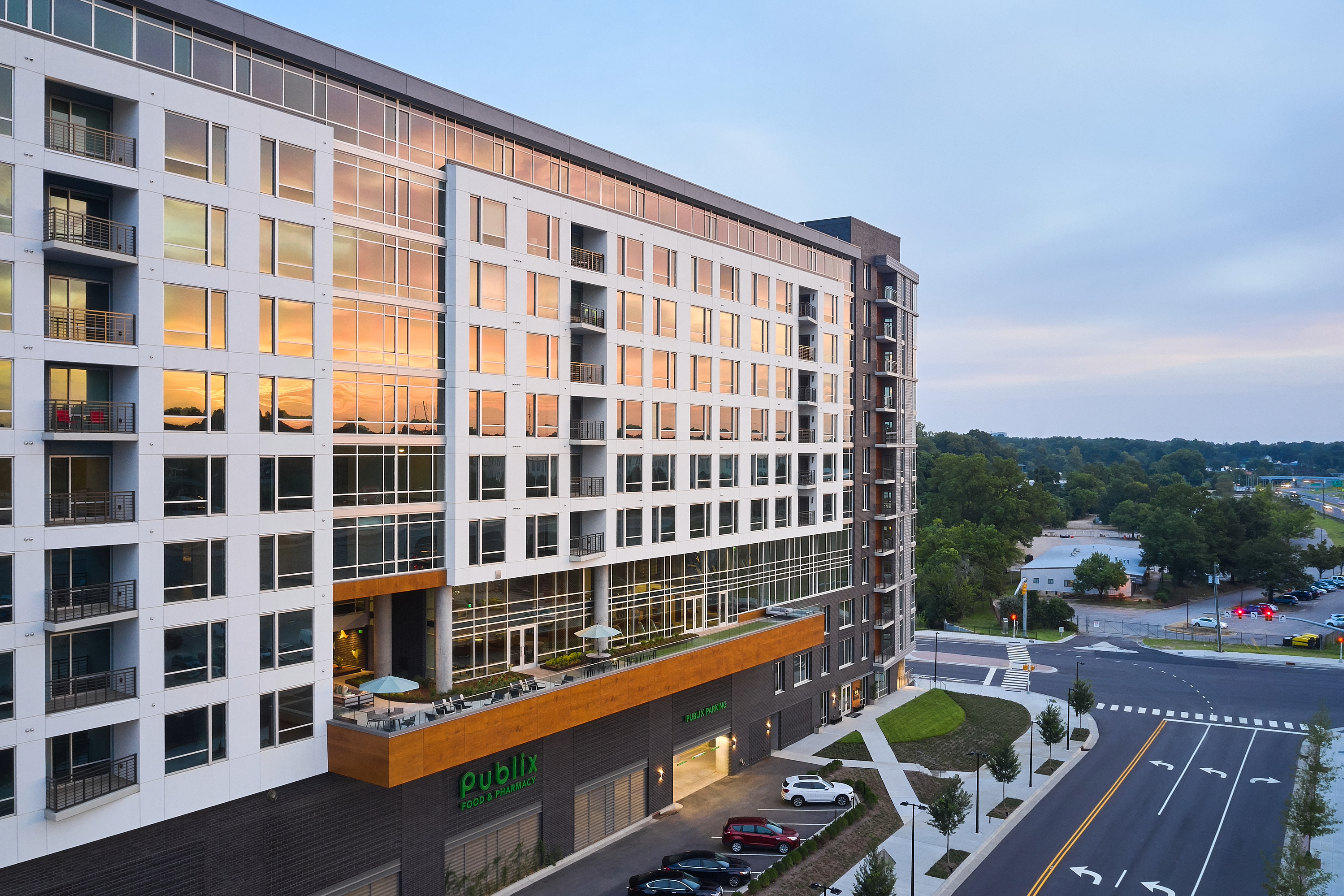
It was both rewarding and challenging. It was certainly great to be able to provide the downtown community with their first national grocery store since they have been underserved for a long time. As far as designing a cohesive project, having a big retail anchor like Publix ended up being fairly easy to plug into our overall elevation and massing strategy of a visible base, middle, and top. The Publix store and parking are the base and foundation on which the building rises. The majority of Peace’s building base is the portion of the program that the community uses every day which is great from a neighborhood immersion standpoint. The main challenge was getting Publix’s structural requirements to work efficiently for their parking, their store, and residential units above. It made for some unique column conditions in the residential portion of the building.
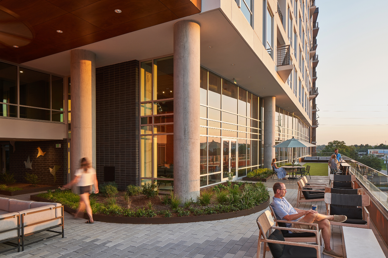
What is your favorite space or design feature within Peace Apartments?
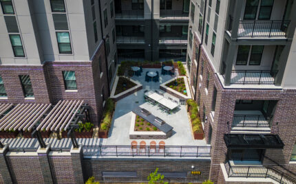
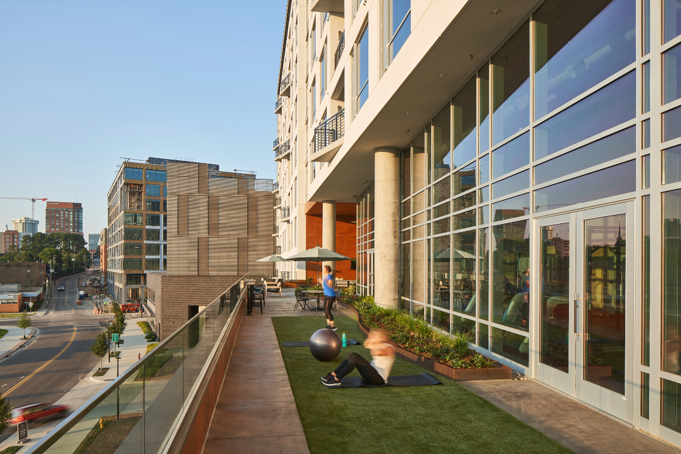
The terrace overlooking Harrington Street is my favorite space. From an architectural standpoint, the terrace and adjacent 2-story glazed amenity space add life to a very large façade. The terrace draws attention to the project from an off-site point of view, whether it is from the sidewalks below or the vehicular passersby on Capital Boulevard. The experience standing on the terrace is even better. Beyond the bevy of amenities that occur on or around the terrace, space also allows residents to feel a sense of a larger connection to the neighborhood – whether it’s Publix, Smoky Hollow Phase II, or views of downtown. It is a good place for reflection upon one’s place within the larger surrounding community.